Print Express Customers & Clients
From local businesses to international authors. From personal orders to bulk printed materials. No order was too big or too small for small-format printing. Focusing on that niche taught me a lot about paper. I gained the knowledge to use papers and designs based on the client’s needs.
Menus, posters, flyers, brochures, postcards, business cards, and invites are just a few of the many designs I made.
Prime Kut Prints
This was one of the last companies, and my favorite order, I worked with at Print Express. They were a new and upcoming meat company and wanted to market their brand.
The first design was the flyer. They had requests from grocery stores and other companies to have a flyer to get the word out. They wanted to show what type of boxes they had, tell people who they were, and how they could reach them.
The next design was a business card. The three names are the three people working at Prime Kut. They also wanted to have their website on the card so that customers and prospects could check out and order meats from their website.
Another card they had me design was an Out-Of-Stock card. This would be placed at the bottom of the box before packing the meat. When a customer uses the last of their meat, they can see the card and use the information on the card to order more meat.
And finally, the design for the stickers they wanted on their boxes. They wanted to thank customers and let them know that the coolers the orders come in are reusable and reduce the environmental impact.
Agent Orange Awareness Flyer


This design holds a special place in my heart. Unfortunately, the subject is sad. It is about Keith Smith, a man who passed away from a disease, one of many, caused by Agent Orange. In summary, Agent Orange is a chemical spray that the U.S. government used in the jungles of Vietnam to kill the foliage.
His wife wanted to create something that had all of her evidence of him being exposed to Agent Orange in Vietnam and I had the idea of creating a brochure with the fold being parallel. I used the color purple, because he was a recipient of the purple heart, and orange, because of Agent Orange. On the inside of the brochure is a timeline of what Keith did in Vietnam, his wife kept all of the letters he sent to his parents to create the timeline and document but did not have any visual way of showcasing it.
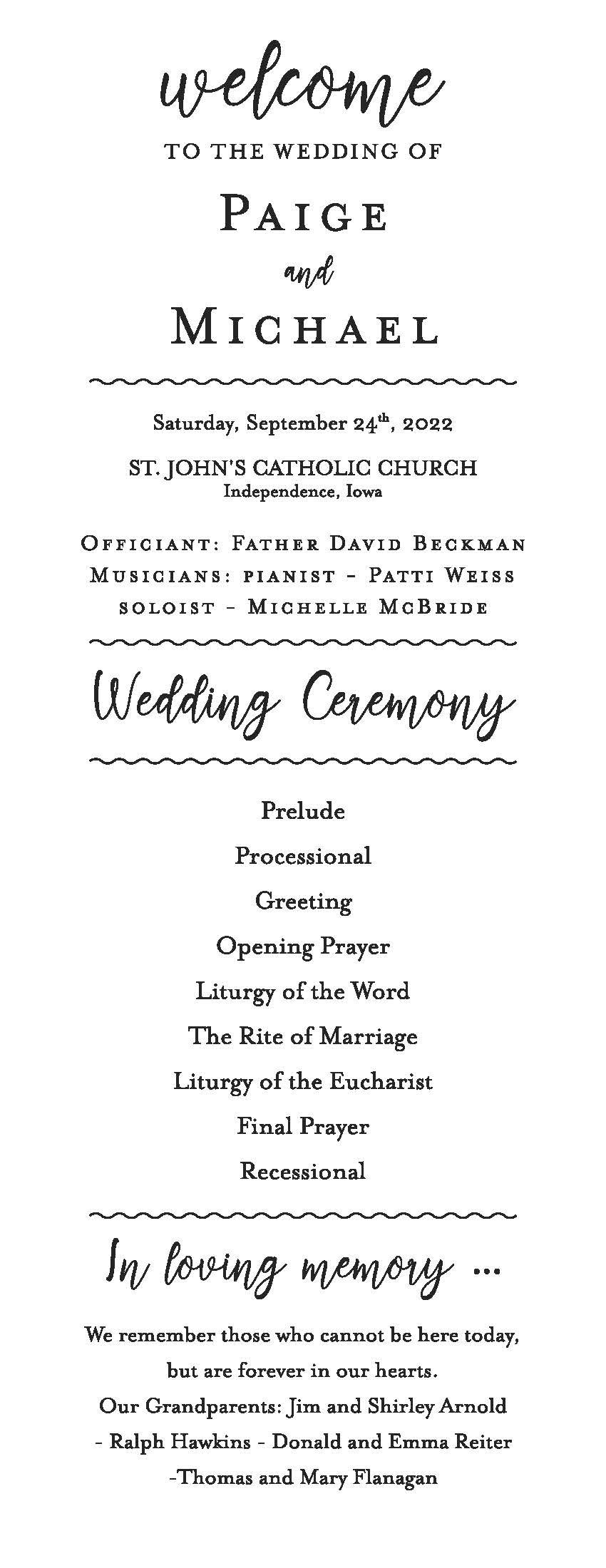
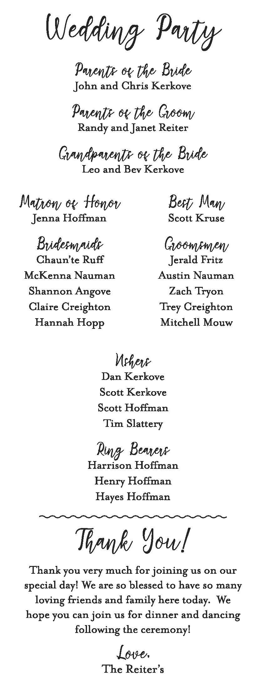
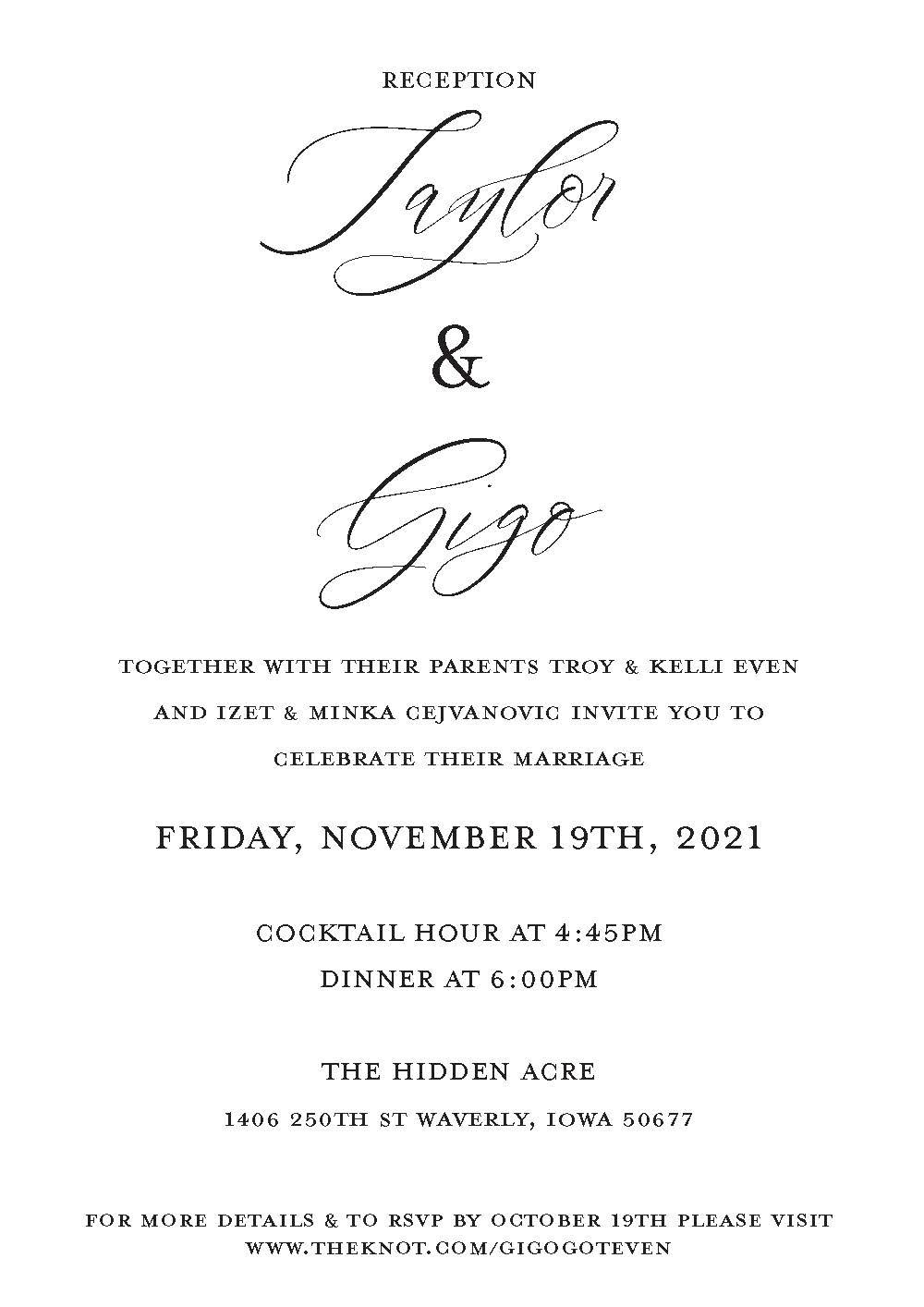
Wedding Print Materials (Misc.)



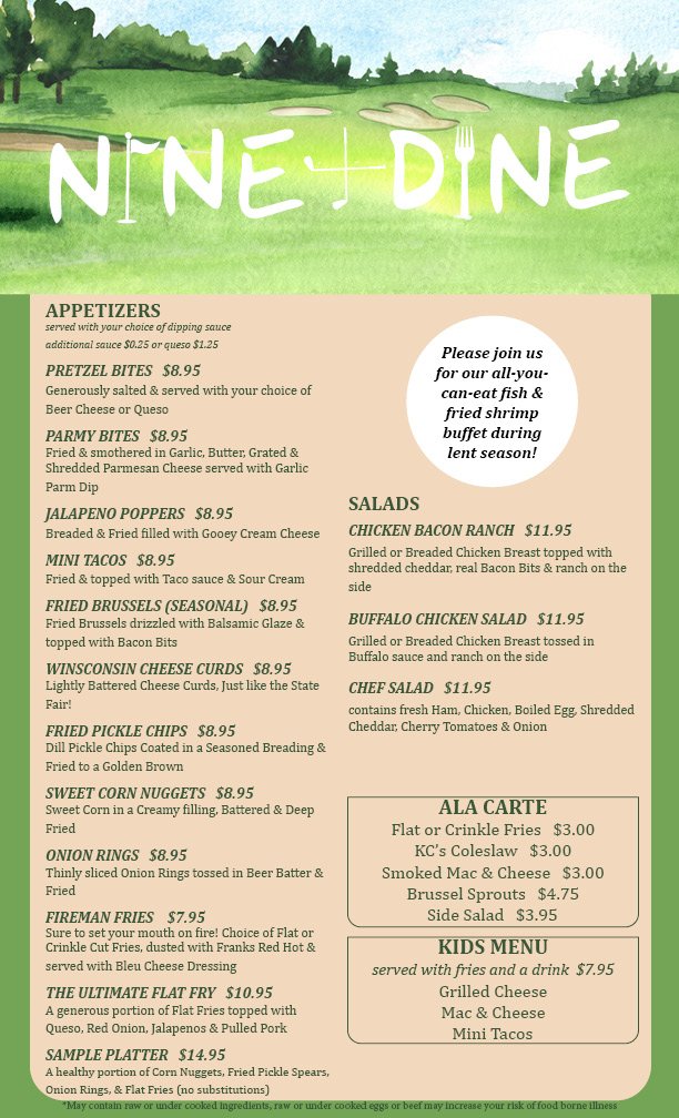
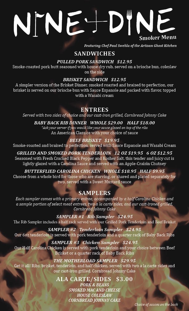
Nine + Dine Menus (Main & Smoker)


Bridal Shower Mailing Postcard


They wanted wood and greenery for the background with the information for the shower. I really had fun designing this and the client, who was the maid of honor to the bride, was excited to give this to the bride to mail out.
Helmuth Country Store Prints


The Helmuth Country Store is an Amish store that sells indoor and outdoor furniture among other items. When they first came in, they wanted to update there brochure. I asked if they wanted to update their logo, as it was static and had mute colors. I feel I refreshed it while still using their key graphic, the horse and the buggy. They would keep coming back to order more print materials. Business cards were the next prints. They wanted to use a photo of their store as the background and give a list of things they sold. COMING SOON: The 26-page catalog I worked on for their outdoor products!
Farmer’s Merchantile Hall Flyers


About every month Garrison, Iowa will have a band play. They order flyers and want them themed based on what band is playing. The flyer on the left was for a band playing (all in Garrison, Iowa). Catfish Keith has a blues and American roots genre, so I wanted the flyer to reflect that.
The flyer of the band Switchback which is American Roots and Celtic Soul. So I tried to establish it on one genre and focus on that.
For the flyer for Bucktown and Revue Friends I wanted to make it look like photos on the wall with information on the bottom about the time, place, and date of the event.
And finally, Lori King and Junction 63. I liked the colors and how flashy and jazzy it is. I focused on limiting color, using colors I do not normally use, and using rectangular shapes.

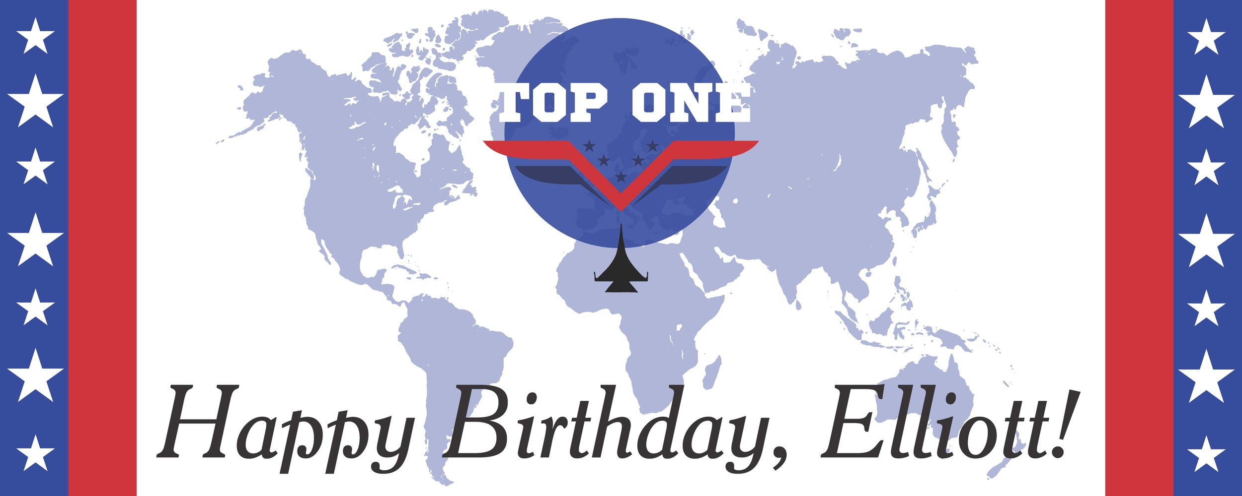


A mother stopped in wanting to get some birthday items. She wanted a gloss poster, invites, and signs originally, and came back again to get a gloss banner. She wanted to go all out since he was turning one and it was her final kid. She also wanted the theme to be "Top Gun."
The ticket is on the top left. I wanted to create a ticket as if the invitees were going to fly to see the kid. I got inspired by boarding tickets and used their layouts to create a ticket. I also created the logo to look similar to the "Top Gun" poster.
The item on the top right was a gloss banner. I reused some art from the other designs to create this.
The middle right was the gloss poster. I wanted to use jets in the background because in the movie they fly in jets.
The two signs on the middle left and lower left were for drinks and the room in which they would celebrate the kid's birthday.


